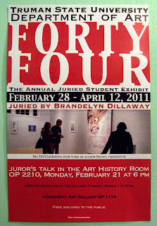
While visiting my old stomping grounds, I noticed this poster for several reasons. Since the exhibit was winding down, I felt no guilt in taking it for further study.
And to be perfectly clear, I mean no disrespect, these are just my opinions. I simply bring to the table observations and skills developed through trial and error, and with the feedback of those who want the best possible product.
The left is a scan, but in case you didn't believe me on the margins, a photo is on the right.
Now, at the risk of sounding like Ralphie's teacher from
A Christmas Story ... "Margins! Margins! Margins!" Things just seem too tight. On the other hand, if you're going to do a full bleed, then do it. "Forty Four" almost makes it to the right, and is short on the left. That may be due to how it was printed, but given how the top and bottom of the text bleeds out from the red, I think they were reaching for the full bleed on every side. The bottom box can be tightened up a bit, as I think there's too much space between the lines.
Overall, I like the boldness of the "Forty Four" as a header, except for the reasons stated above. And I like the photo. However, perhaps a montage of works actually in the exhibit would've been more appropriate.
The original is on the left, with my remake on the right.
The original poster's canvas is 11-3/8" x 17-3/8". My redo is 11" x 17". I matched up the fonts as best I could, and with the exception of "Forty Four," I gave the text a little more breathing room. ("Margins!") I shrunk the bottom box, condensing things, and bumped up the size of "visit tsugallery.org" because why wouldn't you?
Their finished product is a good draft, and it suffices, but do you want things to simply suffice? I made some minor changes, but as a whole, I believe they make a great deal of difference.


No comments:
Post a Comment